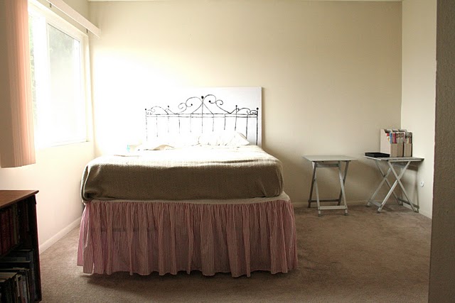
It's hard to believe that it's been one year and 4 days since I wrote this post, showing pictures of our new (and very un-decorated) home in San Diego. I thought it would be fun to celebrate our one year anniversary with San Diego by showing how the rooms have evolved over the past year!
We'll start with the guest bedroom, which now looks absolutely nothing like the first picture I snapped:
The first make-over was very bright, young, and springy, which I loved until Fall/Winter rolled in and it started feeling a little too bright and springy.
I eventually decided to start all over, this time focusing on storage in order to make way for a desk and bookshelves.
You can click here to check out the "before" of that headboard, by the way.
I love the chair, the bookshelves, the painting and the headboard, but the room still needs a little something. I don't know what it is, but suggestions are welcome!
The master bedroom started out pretty bright and sparse.
Then I did an anthro-style makeover to make it look a little more cozy and warm for the winter.
And now we're back to a simpler, brighter look:
The bolster came from anthro and was a gift from my mama:) I'd like to get matching end tables for this room, and I'm considering painting the dresser at the foot of the bed. Thoughts?
The portrait on the left is the newest addition to my 20th century portrait collection.
We'll start with the guest bedroom, which now looks absolutely nothing like the first picture I snapped:
The first make-over was very bright, young, and springy, which I loved until Fall/Winter rolled in and it started feeling a little too bright and springy.
I eventually decided to start all over, this time focusing on storage in order to make way for a desk and bookshelves.
It looked something like this for quite awhile:
and it currently looks like this:
You can click here to check out the "before" of that headboard, by the way.
I love the chair, the bookshelves, the painting and the headboard, but the room still needs a little something. I don't know what it is, but suggestions are welcome!
The master bedroom started out pretty bright and sparse.
Then I did an anthro-style makeover to make it look a little more cozy and warm for the winter.
And now we're back to a simpler, brighter look:
The bolster came from anthro and was a gift from my mama:) I'd like to get matching end tables for this room, and I'm considering painting the dresser at the foot of the bed. Thoughts?
The portrait on the left is the newest addition to my 20th century portrait collection.
The man I bought it from actually laughed when he realized I was buying it because of the portrait, and not because of the frame. He said he'd planned to throw out the portrait because he didn't think anyone would want it, LOL. I got rid of the smoky glass, gave the frame a fresh coat of yellow paint, and I'm loving the results. Oh, and in the lower right corner the portrait says "Frederica", in case you wondered what I named her:)
You might recognize the "art" above our bed from somewhere else in the house...
I removed the legs, got rid of the glass, and used the top as a giant frame for a giant .... potholder? Remember those potholders you made at camp when you were a kid, the kind where you took stretchy fabric and wove it together? That's pretty much what I did here, using scraps of various white things such as old t-shirts, tablecloths, sheer curtains, and even white garbage bags!
A few weeks ago we bought a new bathroom rug from world market, but other than that I don't think a single thing has changed from this time last year.
So that's it for Part I, next up: the downstairs!


love the before and after pics! thanks for sharing. I do love the anthro-style master bedroom, it looks super cozy and warm.
ReplyDeletechange is so much fun! Thanks for sharing the little bits along the way.
ReplyDeleteI love that things are constantly evolving in your home. I tend to get it set and never touch it again. You inspire me to take fresh looks around and mix it up a bit. Thank you!
ReplyDeleteThis is such a fun post! And I love what you've done with Frederica! ;)
ReplyDeleteHEY!!! SO happy to see all the wonderful changes!!! SO AWESOME!!! Miss talking to ya on here! We will be in SanDiego SOON!!!! My best friend lives in HillCrest so maybe we can have lunch!!!
ReplyDeleteI love your home so much.
ReplyDeleteIn my opinion what's missing from the guest room is... height. I like all the elements, but everything is low and horizontal, giving it kind of am empty or unfinished feeling above the waist. As to how to fix that, I suspect your ideas would be far better than mine!
I love the art you did for above your bed, I kinda wanna be a copycat and make one of my own:) Your house started out cute & is only even cuter now.
ReplyDeleteJader - I live in Ocean Beach, which is just a short drive over from Hillcrest. Shoot me an email at whitewaxflower@gmail.com and let's meet up!
ReplyDeleteErin - I think you're exactly right about the height! There's a sisal rope wall-art project on design*sponge that I've been wanting to try forever. I may make that and then hang it over the headboard. Thanks for the suggestion!!
papercup - It took a while to make it, but I love the results! It's kinda funky so I didn't know if anyone besides me would like it, haha. I'm glad I'm not the only one!
Thanks guys for your sweet comments:) Round 2 of the townhouse tour coming up this afternoon!
xoxo